Many are probably already acquainted a pop-up restaurant and bar located in the Lappeenranta campus of the LAB University of Applied Sciences. Tasted the world on their tongue and enjoyed relaxing mood of a pop-up restaurant underneath different names. But have they ever heard about GastoBar Saimaa truly? Probably not. GastroBar Saimaa is a unique learning environment in which the tourism and hospitality students can put their skills to the test by opening a real pop-up restaurant for a day. Despite of activities of pop-ups, GastroBar Saimaa’s brand identity has left thin.
“GastroBar Saimaa’s brand needs to be more defined to gain more public exposure and that way ensure its continuous development”, Jukka Moilanen and Ann-Mari Karvinen (2021a), founders of GastroBar Saimaa point out.
People are known to judge books by their covers. Whether this is fair or not, the perceived value of a product or service is frequently higher than the actual value. As a result, visual identity is a crucial component of brand development. Logos and visuals help people remember the brand and the experiences associated with it, much like putting a face to a name. (Airey 2010, 21.)
Visualizing the brand core
Wheeler identifies 10 steps on building a visual identity to a brand (figure 1). To create a logo, there needs to be an understanding of the brand’s essence and the message it wishes to convey. Each element of a logo symbols, fonts, and colors, influence the consumer and must therefore be carefully considered. (Wheeler 2018, 149.)

For creating a visual brand element for GastroBar Saimaa, data was collected from a survey that was pointed out to LAB and LUT staff members and students. The aim was to gather information about how people feel and see GastroBar Saimaa and how the brand affects them. Brand essence was first identified and worked as a base for creating visual identity. (Roiz & Fadeeva 2021.)
Brand’s visual identity
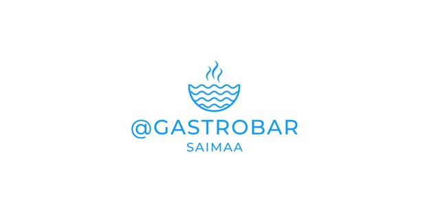
Based on the research results, current situation, and brand essence analysis of GastroBar Saimaa, logo was created. GastroBar Saimaa was described by several survey participants as a fresh, innovative, and educational (figure 2). The logo’s primary color is blue, which stands for learning, freshness, and nature, linking specially to Lake Saimaa. The icon itself is shaped like a bowl capturing the main business idea. Inside the bowl, waves represent nature, and the waves on top, freshness. The logo is created in a minimalistic style in line with current design trends. (Roiz & Fadeeva 2021.)

Usage of brand’s visuals
“We are overly thrilled to get a logo to our marketing communication materials. It supports nicely our main goals and helps to gain more awareness of the brand among our current and potential customers”, Jukka Moilanen ja Ann-Mari Karvinen (2021b) state.
Now that brand essence and visual identity has been defined, GastroBar Saimaa is more recognizable by its current and potential customers well as by potential cooperation partners. Using the logo in marketing communication materials, promotional events will strengthen visibility and awareness of the brand over the time. However, developing the brand further requires time, planning and execution the fullest.
Authors
Iuliana Fadeeva and Boris Roiz are graduating students of Tourism and Hospitality Management at LAB University of Applied Sciences and have written this article as a part of their thesis.
Taina Orpana is a Senior Lecturer in LAB Applied Sciences Faculty of Business and has been guiding Fadeeva’s and Roiz’s thesis.
References
Airey, D. 2010. Logo Design Love: A Guide to Creating Iconic Brand Identities. Berkeley, CA: New Riders.
Moilanen, J. & Karvinen, A. 2021a. Senior Lecturers. LAB University of Applied Sciences. Interview on 19th January 2021.
Moilanen, J. & Karvinen, A. 2021b. Senior Lecturers. LAB University of Applied Sciences. Interview on 15th June 2021.
Roiz, B. & Fadeeva I. 2021. Building a successful and recognizable brand for GastroBar Saimaa. LAB University of Applied Sciences. Thesis. [Cited on 19th May 2021. Available at http://www.urn.fi/URN:NBN:fi:amk-202105199372
Wheeler, A. 2018. Designing Brand Identity. 5th edition. Hoboken, New Jersey: John Wiley & Sons, Inc.


